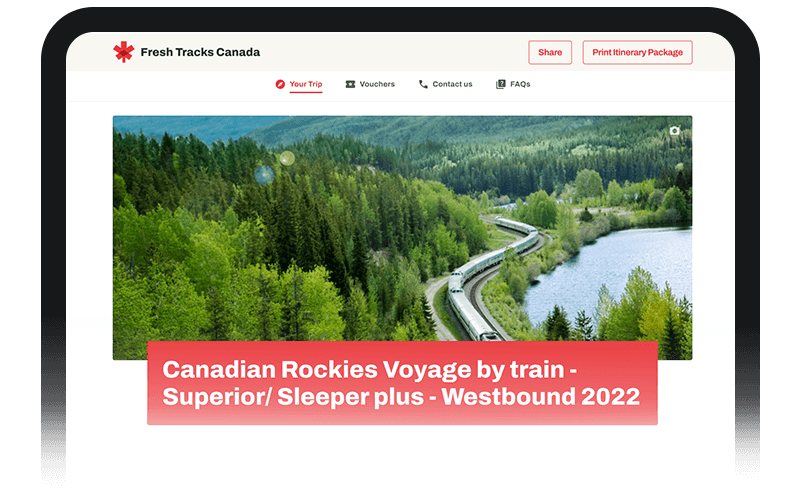
Building a Traveller Friendly Predeparture Documentation Experience
In an effort to provide travelers with exceptional customer experiences, we embarked creating a version 2.0 of our Pre-departure documentation web experience. The project aimed to develop a comprehensive Predeparture documentation platform tailored for luxury train adventures. The primary objective was to equip travellers with the essential information they need to prepare for their journeys, while enhancing their overall experience through thoughtful design and personalization.
Role
Product Designer
Fresh Tracks Canada
Travel and Tourism
Predeparture Documentation Version 2.0 Web App experience with mobile-first design.
Challenge Statement
Our challenge on this project was to design and develop a web app platform that revolutionizes the way luxury train travelers access and interact with their predeparture documentation. This platform must seamlessly integrate personalized information, such as preferences and interests, with a progressive disclosure system that presents journey details in a user-friendly manner. The goal is to empower travelers to embark on their luxury train adventures fully informed, prepared, and excited.
Key Objectives
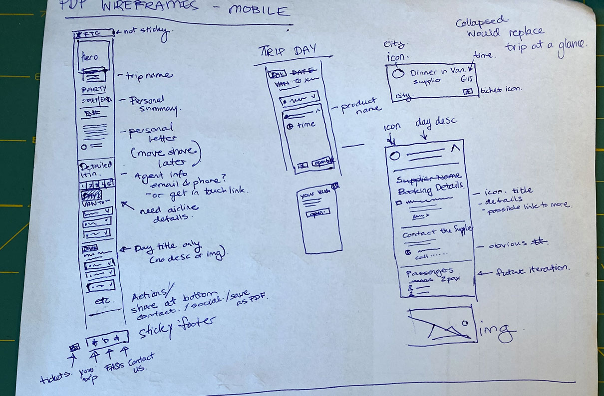
Being Mobile First: Most of our users will be using this touchpoint on their phones while they travel and before they begin their journey. Be flexible and concise enough to delivery content that allows travelers visualize their journeys and be well prepared to be ready for their trips.
Reduce Cognitive Load: From the research data we have understood that our users are overwhelmed with the information we have for them to go through. Our objective will be to implement a day-by-day itinerary system that utilizes progressive disclosure, striking a balance between offering an overview of the journey and unveiling detailed information progressively.
User-Centric Design: Create an intuitive information architecture that categorizes content effectively, ensuring easy access to essential information such as itineraries, packing lists, local insights, and more.
Effortless Accessibility: Design and develop a responsive web app platform that offers a seamless experience across various devices, allowing travelers to access their documentation conveniently.
Research and Strategy
User Persona Development: The project began with the creation of well-defined user personas representing different types of luxury train travelers. These personas will guide the design process and ensure that the documentation meets the needs of a diverse range of travelers.
User Insights: Through user interviews and surveys, we gathered insights into travelers' expectations, concerns, and preferences when it comes to predeparture documentation. This data will inform the content, personalization features, and design elements.
Competitor Analysis: An analysis of existing predeparture documentation processes within the travel industry will be conducted. This analysis will help identify industry best practices, gaps, and opportunities for differentiation.
Testing and Iteration:
Usability Testing: Conducted usability testing with a group of potential travelers to identify any pain points, confusion, or usability issues. Gathered feedback on the personalization features, progressive disclosure, and overall content organization.
Feedback Incorporation: Incorporated user feedback into the design and functionality. Refined the progressive disclosure mechanism based on users' interactions and preferences.
Launch and Results:
User Reception: The web app was launched with positive feedback from travelers. Users appreciated the tailored approach, finding the information relevant to their needs and preferences.
Reduced Cognitive Load: The progressive disclosure approach significantly reduced cognitive load, as users could explore detailed information at their own pace, without feeling overwhelmed.
Efficiency and Preparedness: Travelers reported feeling more informed and prepared for their luxury train adventures. The day-by-day itinerary allowed them to visualize the journey ahead, enhancing their anticipation.
Business Impact: The user-friendly predeparture documentation experience contributed to an enhanced brand reputation for providing exceptional customer service. This, in turn, led to increased customer loyalty and word-of-mouth recommendations.
Conclusion
Through meticulous research, thoughtful design, and iterative testing, we successfully created a traveler-friendly predeparture documentation experience. By personalizing information, utilizing progressive disclosure, and employing elegant visual design, we not only reduced cognitive load but also empowered luxury train travelers to embark on their journeys with confidence and excitement.
View Detailed Visual Behance Project
Coming Soon


